Colour blindness and data visualisation
I’ve recently been working on a leads reporting tool at my new workplace. The tool plots colour coded metrics onto a graph to give users a breakdown of how their lead generation mechanisms are working for them.

Illustration of the graph
Every week we have a call where all developers get together to present the work we have completed to each other and any other interested parties. Whilst I and another developer were presenting the tool, another developer on the call raised a concern that he was struggling to make out the metrics and their corresponding graph lines.
As it transpired he has a form of colorblindness, something which was overlooked as a potential issue to using this tool throughout the design and build process.
Initially I was embarrassed to have overlooked something which as a front end developer I feel is my responsibility to be aware of. When building web UIs in general I’ve always tried to push for strong colour contrast as well as trying not to rely on colour for context in order to help users with visual impairments. Luckily the reporting tool is being actively developed so we were able to look at improving the experience for colorblind users.
Friendly colour pallets
One step we took towards improving the user experience was to use a more friendly colour pallet. Doing some research we found this article about colour visualisation for large data sets
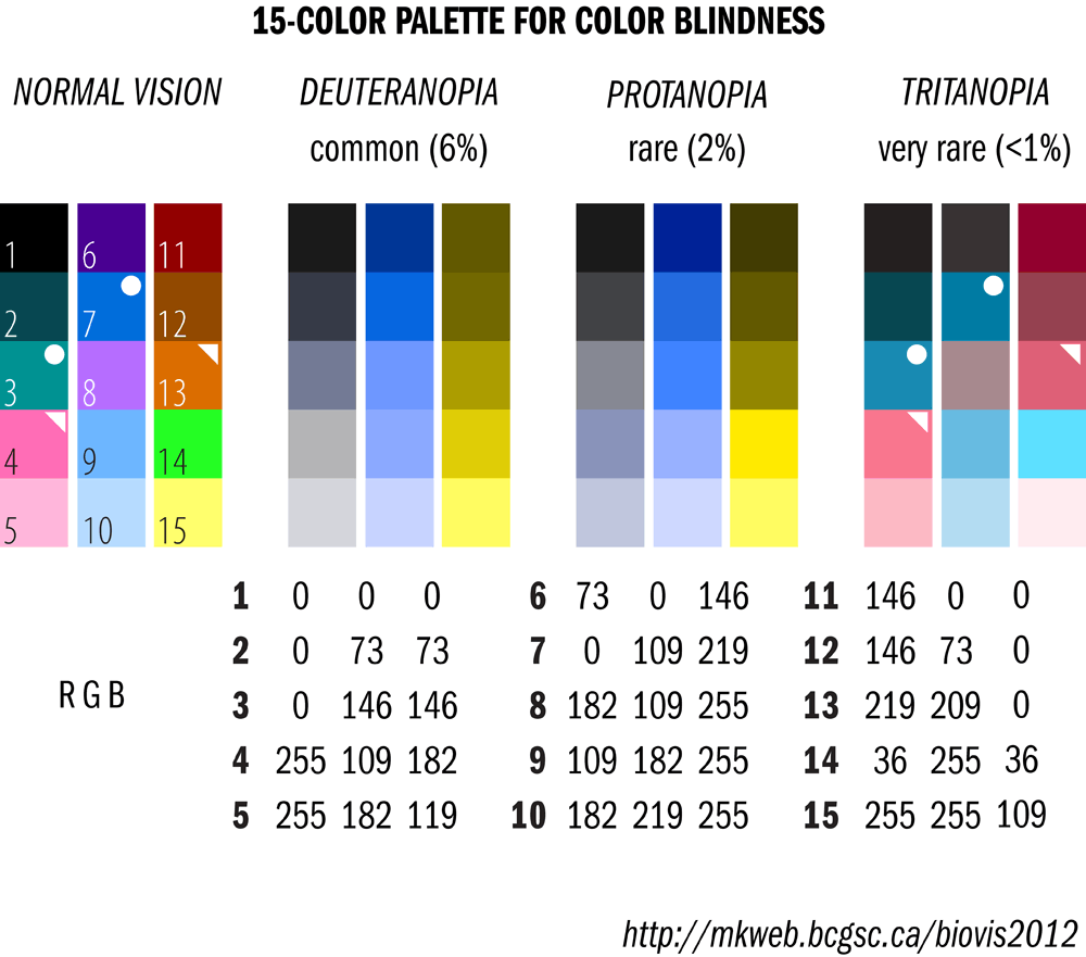
Color blindness friendly palette
Using this pallet across our 12 metrics means that the colours are distinguishable to as many different degrees of colour sightedness as possible.
Testing tools for colour blindness
Colour blindness can take various forms and so being able to replicate it is an important step in order to avoid UX issues. I’ve found the Spectrum Chrome extension very useful for mocking colour blindness. Opening the reporting tool and switching this extension to the most severe setting, it quickly became apparent the difficulties people could face. Below is an illustration of how the tool looked with Spectrum set to achromatopsia.

Illustration of the graph with Spectrum set to achromatopsia
Whilst this is an extreme case of colorblindness, it highlighted that not all issues could be resolved through colour pallet alone.
Graph line thickness
Another idea we had was to change the line thickness when, for instance, hovering over or focussing on the metric key.

Graph line thickness now changes on hover / focus
We found that even on our most extreme colour disability test that by interacting with the metric keys, you can determine which graph line is associated to it.
Ability to disable metric graph lines
The final improvement we made was to add the ability to disable graph lines individually by clicking on the metric key in question. This allows users to look at a smaller set of graph points, which again should help users determine which metrics are which.

Graph lines disabled to add clarity for colourblind users
Takeaways
There were a number of takeaways I have from this experience.
Firstly is the Importance of user testing and feedback. As someone with an average level of ability to perceive colour, the issue was easily overlooked and was only caught by user feedback.
Another takeaway for me was the importance of proactively testing for known disabilities on every UI I’m involved in creating. There are lots of environmental and personal factors that can affect the way users interact with a website and it’s our responsibility as UI developers to be thinking about these issues.
My final takeaway from this experience was the importance of iterating on products. Had we taken a waterfall approach to building this product and discovered this further on in the project it may have been too late to make the changes needed to improve the user experience.