Creating a custom HTML input type
TL;DR - Use existing input types, visually hide them and use CSS and JS to create new input types on top.
HTML Input Types
The web offers us some great forms of input straight out of the box: text boxes, check boxes, select dropdowns and more recently new input types such as the range element.
When used properly these give us many benefits for free such as:
- Providing semantic meaning to input
- Device specific UI
- Accessibility
- Basic validation
But recently on Drum Machine I’ve felt the need to create custom input types.
One of those is the ‘rotator’. This is very similar to a range input, but instead of sliding horizontally, the rotator rotates from left to right much like potentiometers do on real drum machines.
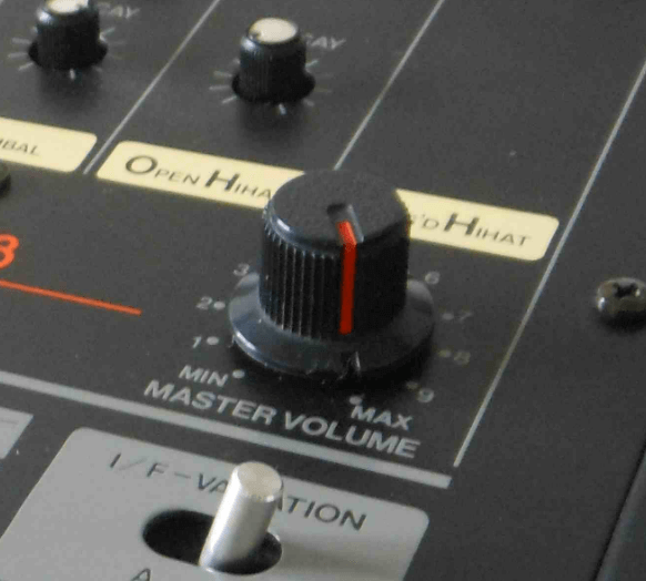
Potentiometer from a Roland TR 808
Whist I could have just used a simple range input, for me there are a number of benefits of a custom rotator input:
- As a developer, I have complete control of the look and feel of the input
- A rotator input can be controlled with more granularly than a range input
- This means a rotator can take up less space than a range input
- It feels more true to a drum machine to have a rotator
With all that said, here’s how I created it.
The HTML
One thing I wanted to make sure I didn’t lose when creating the rotator was the all of the benefits of preexisting input types that I mentioned above. With that in mind, the HTML foundation for the custom input is as follows:
<div class="rotator">
    <label for="custom-input">Volume</label>
    <input type="range" min="0" max="100" step="1" id="custom-input" />
    <div class="knob"></div>
</div>
For me, the biggest benefit of this structure is accessibility. If a screen reader hits this block of HTML, it has semantic meaning. A blind user should therefore be able to make sense of the rotator and interact with it. If a keyboard-only user hits this, they will be able to operate the rotator (provided the browser supports keyboard commands for input type range).
The result is this:
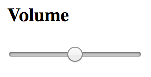
Volume without CSS
The CSS
Without CSS this piece of HTML looks nothing like a rotator. In order to make it look like a rotator, first off we can ‘visually hide’ the range input using a technique from Jonathan Snook’s blog. In contrast to display: none; this technique means that whilst the range input appears not to be there, screen readers and keyboard-only users can use it to manipulate the rotator.
Other than that the CSS is fairly fairly simple for the rotator itself. It gets applied to the div with a class of ‘knob’ as follows:
.knob {
    width: 100%;
    padding-bottom: 100%;
    border-radius: 50%;
    background: #000;
    position: relative;
    &:after {
        content: "";
        width: 2px;
        height: 7px;
        background: #FFF;
        position: absolute;
        top: 3px;
        left: 50%;
        margin-left: -1px;
    }
}
The knob takes on the width of it’s parent and uses the aspect ratio trick to keep the height of the knob the same as the width (responsive win!).
To give the knob rounded edges I’ve used border-radius: 50%;. The :after psuedo element is used to create the tick, indicating how rotated the rotator is.
You can also give a visual hint to keyboard-only users of when they are focussed on the range input with CSS like this:
.rotator input:focus + .knob {
    border: 2px solid red;
}
The end result is something that looks like this:
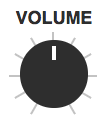
Volume without CSS
The Javascript
The only thing that’s left to do is respond to mouse and touch events on the ‘knob’ div. Paul and Surma from Google have a great live coding example of working with mouse and touch events to create swipeable cards. I modified this example to work as a rotator, the code for which you can see here.
To see the rotator in full action, check out my Drum Machine project.